Section 1
We start from familiar supervised evaluation, use it to expose example-level difficulty, and then introduce IRT as a language for ability, difficulty, discrimination, and ICCs.
Associated Notebooks
If you want to follow this overview locally or in Colab, this combined section is organized around two guided notebooks:
01_00_supervised_evaluation_toy_problems.ipynb, which introduces example-level difficulty through the supervised motivation.02_00_binary_irt_and_2pl.ipynb, which develops the Binary IRT and 2PL overview itself.
Both notebooks can import the shared workshop helpers from utils/handson.py and utils/transform.py.
Binary IRT as a language for evaluation
In a labeled setting, it is tempting to rank models by accuracy, F1, or another aggregate score and then stop. But the supervised examples already show the limitation of that habit: two models can have similar average performance while hesitating on different examples, and the difficult cases are usually not spread uniformly across the data. They concentrate around ambiguous regions.
That is why supervised evaluation belongs here as the entry point to IRT. It gives the first concrete version of the workshop’s central question: are all instances equally difficult when we evaluate a model? Once the answer is clearly no, the need for a latent language becomes much easier to motivate. IRT gives that intuition a formal structure. Instead of speaking only about a model score, we begin to speak about latent ability on one side and item properties on the other.
In the binary IRT setting, each response is treated as success or failure. That could be a correct answer, a solved item, or any binary outcome that distinguishes stronger and weaker respondents. The central question becomes probabilistic: given a respondent with latent ability θi and an item with latent parameters, what is the probability of success?
This is a conceptual shift away from flat evaluation tables. We are no longer pretending that every item is equally revealing. We are also no longer pretending that a respondent can be summarized without reference to the particular items they faced. Ability and item structure have to be read together.
Supervised evaluation gives the first intuition
In the supervised toy problem, labels are available and the evaluation looks familiar. The dataset is intentionally small enough to visualize, so the geometry can be read before any model is fitted. Some points are far from the decision boundary and are naturally easy. Others sit close to the boundary, where different classifiers can make different commitments.
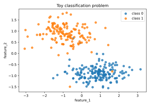
That visual fact changes how the metrics table should be read. A high average score is still useful, but it does not tell us where the model struggled. It does not distinguish errors spread randomly over the space from errors concentrated in one structurally ambiguous region. It also does not tell us which examples are especially informative for separating stronger and weaker models.
| Model | Accuracy | Balanced Accuracy | F1 | Mean Difficulty Proxy |
|---|---|---|---|---|
| KNN | 0.990 | 0.988 | 0.988 | 0.037 |
| Logistic Regression | 0.990 | 0.988 | 0.988 | 0.093 |
| Decision Tree | 0.979 | 0.977 | 0.976 | 0.011 |
The table is deliberately compact, because compactness is both its strength and its weakness. It tells us that all three classifiers perform well. It also hides the local structure of the mistakes. Logistic regression and KNN can look almost tied in aggregate while still expressing different uncertainty around the boundary.
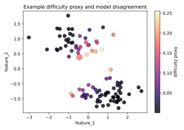
This is the bridge to IRT. In a supervised setting, a model can be read like a respondent and an example can be read like an item. Correctness becomes the binary response. The examples that many models solve easily behave like easy items. The examples that repeatedly induce mistakes, low confidence, or disagreement behave like hard items. Some examples may also be more discriminative: they reveal more about the difference between models because stronger models handle them reliably while weaker models do not.
| Model | Example 27 | Example 79 | Example 119 | Example 224 | Example 287 |
|---|---|---|---|---|---|
| Decision Tree | 1 | 0 | 1 | 0 | 1 |
| KNN | 1 | 1 | 1 | 0 | 1 |
| Logistic Regression | 1 | 1 | 1 | 0 | 1 |
This tiny table is already an IRT-shaped object. The rows are models, the columns are examples, and the entries are binary responses: 1 means the model got the example right, 0 means it did not. Once the data are written this way, the language of IRT becomes natural. A model with more reliable correct responses can be described as having higher latent ability; an example that few models solve can be described as harder; and an example that separates one model from the others carries discriminative information.
The point is not to replace standard supervised metrics. The point is to stop treating them as the end of the evaluation. IRT gives us a way to keep the model-level summary while also asking which examples produced the evidence behind that summary.
A small item bank makes the ideas visible
The notebook begins with a tiny item bank because the geometry of the curves is easier to read when the number of items is small. In this setting, every curve is an item characteristic curve, or ICC. The horizontal axis is ability, the vertical axis is the probability of success, and the position and slope of the curve carry the interpretation.
When a curve sits farther to the right, the item is harder. A respondent needs more latent ability before the probability of success rises substantially. When the curve becomes steeper, the item has stronger discrimination. It does a better job of distinguishing those just below the relevant ability region from those just above it.
That visual language is one of the most important assets of IRT. It gives the audience a way to see evaluation as a structured map rather than a single leaderboard. Once the room can read an ICC, it can start to ask richer questions: where does an item become informative, which items separate respondents best, and which items contribute little to ranking because they are too easy, too hard, or too flat?
The 1PL picture: difficulty changes, slope stays fixed
The 1PL model is the cleanest starting point because every item shares the same discrimination. In that case, the only thing that changes from one item to another is difficulty, so the curves keep the same shape and simply shift left or right.
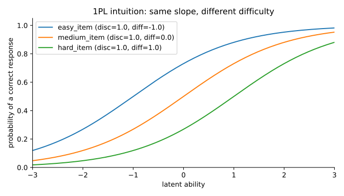
This is where the idea of item difficulty becomes visually precise. Easy items begin to rise earlier. Hard items stay low until higher ability values are reached. The 1PL picture is intentionally restrictive, but that restriction is pedagogically useful: it isolates one idea at a time.
The notebook writes this in the usual logistic form:
\[p_{ij} = \frac{1}{1 + e^{-a_j(\theta_i - \delta_j)}}\]and then specializes to the 1PL intuition by fixing aj = 1. Once that happens, the curves differ only through δj, the item difficulty.
That simplification is powerful because it forces the audience to see what difficulty actually does. It is not a vague statement about an item being “challenging.” In the classical 2PL scale used here, ability θi and difficulty δj live on the real line. Difficulty is a location parameter: it tells us where, on the latent ability axis, the transition from low to high success probability occurs.
The 2PL model adds discrimination
The 2PL model keeps the same basic probability structure but allows each item to have its own discrimination. That means items are no longer distinguished only by where the curve sits. They are also distinguished by how abruptly the curve rises.
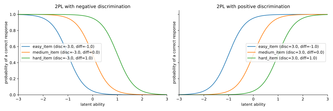
This is the point where IRT stops being only about difficulty and becomes a language of information. A highly discriminative item is valuable because it sharpens distinctions precisely where ranking matters. Two respondents with similar but not identical ability can receive very different probabilities on such an item. A weakly discriminative item changes too gradually and therefore separates respondents less cleanly.
Negative discrimination also appears here as an important conceptual warning. In ordinary didactic examples, we expect stronger respondents to have higher success probabilities. A negative slope signals the opposite. Even before later sections revisit this idea in more complex settings, the audience should already understand that the sign of discrimination is not a minor technical detail. It changes the very direction of the ranking logic.
Holding difficulty fixed reveals what discrimination does
The notebook also isolates discrimination by fixing difficulty and allowing only the slope parameter to vary.
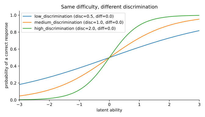
This is one of the most useful visual moments of the section. If all three items become difficult at roughly the same point on the ability axis, the main difference between them is no longer where they change but how informative they are around that change. A high-discrimination item creates a sharp boundary. A low-discrimination item changes more gradually and is less decisive.
This helps the room see that item discrimination is not an abstract coefficient. It is a statement about how much evaluative resolution an item contributes near the region where respondents are being separated.
A table of probabilities makes the curves concrete
The heatmap in the notebook turns the ICCs into a compact table of actual probabilities for a few selected ability values.
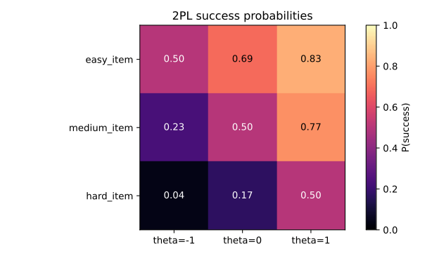
This numerical view matters because it closes the gap between visual intuition and probability statements. The curves are no longer just shapes. They correspond to concrete success probabilities that vary jointly with respondent ability and item parameters. The audience can move back and forth between the graphic and the table and realize that both are expressing the same structure.
Why this matters for the rest of the workshop
Once we move beyond a single dataset-level score, evaluation becomes a relationship between respondents and items. Ability is no longer just “who scored higher.” Difficulty is no longer just “which dataset felt hard.” Discrimination tells us whether an item actually helps to order the respondents.
That prepares the transition to the next section. Logistic ICCs are excellent for binary intuition, but many AI evaluation settings are not naturally binary. Agreement values, proportions, and bounded continuous responses require a richer model family. That is where Beta4-IRT enters the story.
In that sense, the opening section is the conceptual spine of the workshop. It begins with supervised evaluation because that is the most familiar place to see example-level difficulty, and then uses Binary IRT and 2PL to give that intuition a formal language that later sections will extend, generalize, and repurpose in settings that are more realistic than simple right-or-wrong responses.
Questions for Discussion
- What changes visually when only difficulty moves, and what stays fixed?
- Why does stronger discrimination make an item more informative near its transition region?
- Why is negative discrimination so important conceptually, even if it is not the standard classroom case?
- How does this section change the way we interpret difficult examples from supervised evaluation?